User Guide
This is Built It Shortcodes Addon Plugin documentation, containing helpful information, features and detailed instructions about how to use the plugin and shortcodes.
1. Introduction
1.1 Introduction
Built It Shortcodes Addon plugin is the most powerful and clean code addon plugin for the WP Bakery Page Builder. It provides you a power to design professional-looking, stunning, beautiful, and user-friendly pages. In the plugin we provide customer 19 different shortcodes having gripping features. Creating pages has never been easy and fun before this.
User can build complex and content riched pages and any layout that imagined within minutes even if you are not familiar with the coding knowledge. Explore the features and possibilities to design the pages in a hassle free manner with the plugin.
1.1.1 Key Features
- Responsive
- All of the elements are fully responsive, no matter whether it is a laptop, desktop, mobile, or tablet.
- Clean Code
- Built It Shortcodes is as beautiful as it’s designs. Clean, well commented & passionately written.
- Unique Elements
- Each & every element is well pondered & beautifully designed.
- Dedicated Support
- Top notch support is priority. Just drop us a mail or create tickets and we will always be available for help immediately.
- SEO Optimized
- It is SEO optimized that makes your work easier and faster.
1.1.2 Created Date
Created : "09/07/2021"
Updated : "24/06/2025"
Version : 1.0.3
By : Kamlesh Yadav
Email : support@pixelnx.com
2. Installation
Built It Shortcodes Addon Plugin installation doesn’t differ from any other plugin installation process, so you might be familiar with this process already. If not, please follow instructions below. The zip you have received from code canyon, please unzip it and then you will see 2 files:
- builtitshorcodes.zip
- Documentation Help
2.1.1 Steps Of Installation
- Login to your website
- Go to Plugins -> Click on “Add New”
- Browse to the Built It Shortcodes Plugin’s zip file and choose that file.
- Click “Install Now” button
- Wait while plugin is uploaded to your server
- Click “Activate Plugin” button
Note Please make sure that you have already activated the WP Bakery Page Builder.This is the required plugin for the Built It Shortcodes.
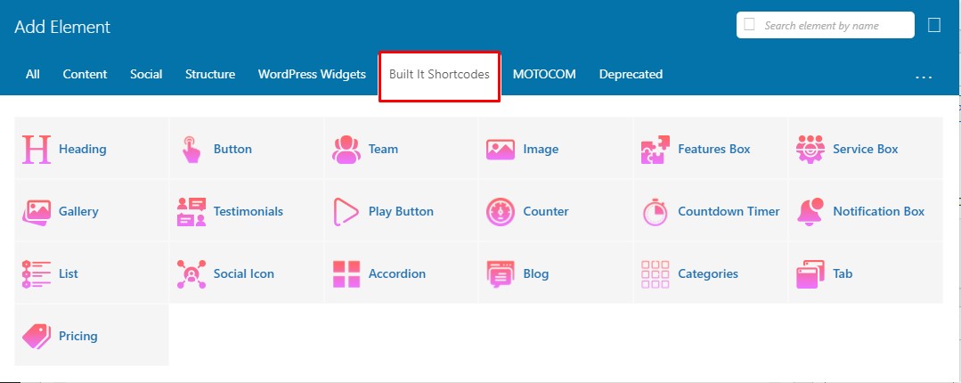
3. Shortcodes
Shotcode is a specific code that lets you do difficult things with very little effort. Shortcodes can embed files or create objects that would normally require lots of complicated, ugly code in just one line.
In this section you will learn and get information about the Built It Shortcodes Addon Plugin's Shortcodes.
3.1 Heading
By using this shortcode users design the heading in the website according to the need.
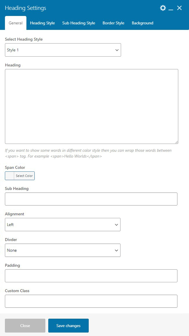
General Settings
- Select Heading Style - Select the heading style as per need.
- Heading - You can enter title of the one section. If you want to show some words in different color style then you can wrap those words between span tag.
- Span Color - You can add or change span color if you added some words in the span tag..
- Sub Heading - You can add the subtitle of the heading section.
- Alignment - You can adjust the heading text alignment according to your need.
- Divider - You can set the divider in the heading by selecting any one option.
- Padding - Using this you can manage your heading size.You can change each of the number individually like 5px 10px 5px 10px. Please don't add a comma(,) between the values, always keep empty space in between them..
- Custom Class - You can enter custom class code here.
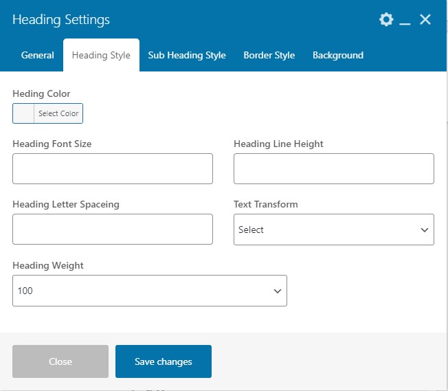
Heading Style Settings
- Heading Color - You can select any color for the heading according to need.
- Heading Font Size - You can adjust the font size of the heading. Please enter the numeric value here.This size will be in Pixel automatically.
- Heading Line Height - Please enter a numeric value if you need custom line height. This size will be in Pixel automatically.
- Heading Letter Spacing - This setting will create spaces between the characters. Please enter numeric value here.
- Text Transform - You can apply the transformation on heading like(Uppercase, Lowercase, Capitalize).
- Heading Weight -You can select the heading-weight according to the requirement.
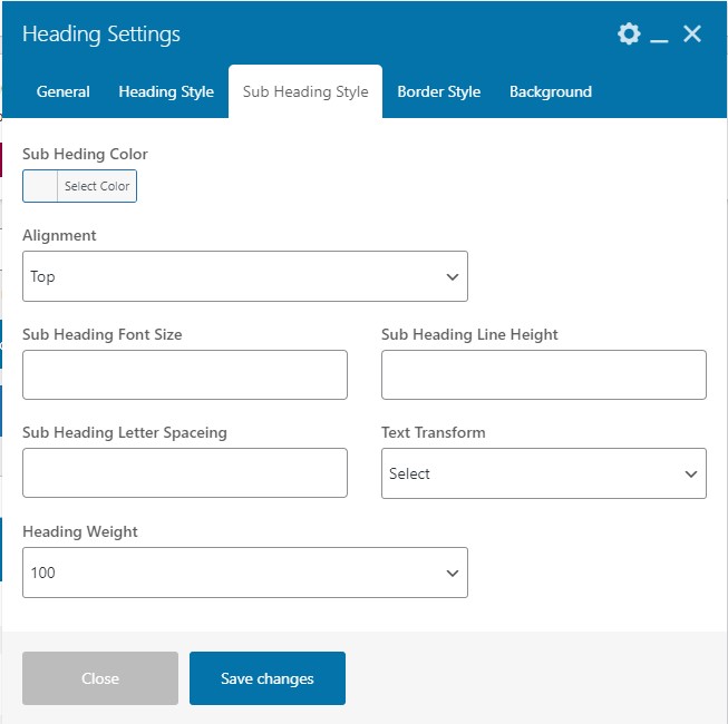
Sub Heading Style Settings
- Sub Heading Color - You can select any color for the sub heading according to need.
- Alignment - You can align the sub heading either in the Top or Bottom .
- Sub Heading Font Size - You can adjust the font size of the sub heading. Please enter the numeric value here.This size will be in Pixel automatically.
- Sub Heading Line Height - Please enter a numeric value if you need custom line height for the sub heading. This size will be in Pixel automatically.
- Sub Heading Letter Spacing - This setting will create spaces between the characters. Please enter numeric value here.
- Text Transform - You can apply the transformation on heading like(Uppercase, Lowercase, Capitalize).
- Heading Weight -You can select the heading-weight according to the requirement.
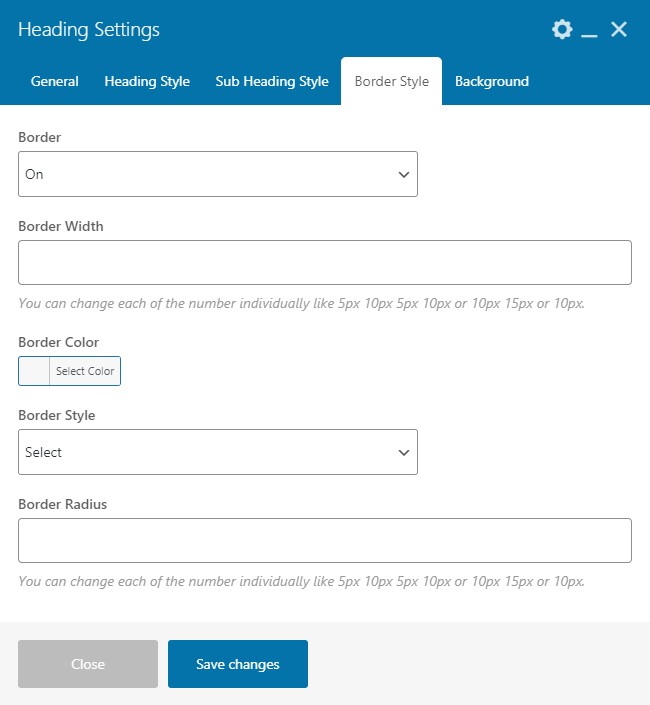
Border Style Settings
- Border - You can add the heading border by selecting the on or off option. If the border will be turned on then you will get the settings accordingly.
- Border Width - You can adjust the width of the border. Enter a numeric value here. You can change each of the number individually like 5px 10px 5px 10px or 10px 15px or 10px.
- Border Color - You can add or change the border color.
- Border Style - You can select the style of the border from the given option Solid, Dotted, Dashed or Double .
- Border Radius - You can adjust the radius of the border. You can change each of the number individually like 5px 10px 5px 10px or 10px 15px or 10px.
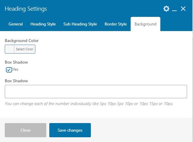
Background Settings
- Background Color - You can change or add the background color of the heading.
- Box Shadow - To enable the box shadow select the checkbox.
- Box Shadow - You can adjust the width of the box. You can change each of the number individually like 5px 10px 5px 10px or 10px 15px or 10px.
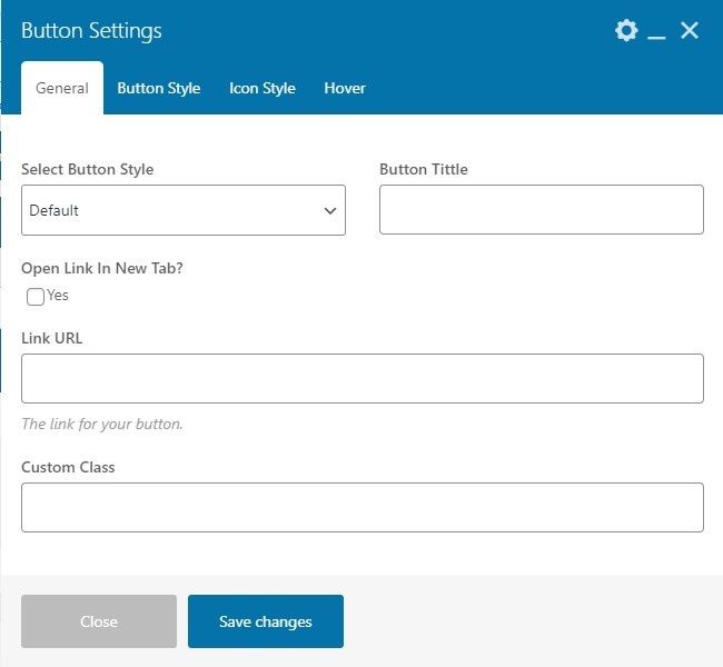
4.2 Button
As the name suggests, with this shortcode you can create button in any section of your website.
General Setting
- Select Button Style - Select the button style as per need.
- Button Title- You can enter the button title here.
- Open Link In New Tab - If you want to open a link in new tab then, select the "On" option.
- Link URL- Enter the URL where you want to redirect the button.
- Custom Class- Enter the custom class code here.
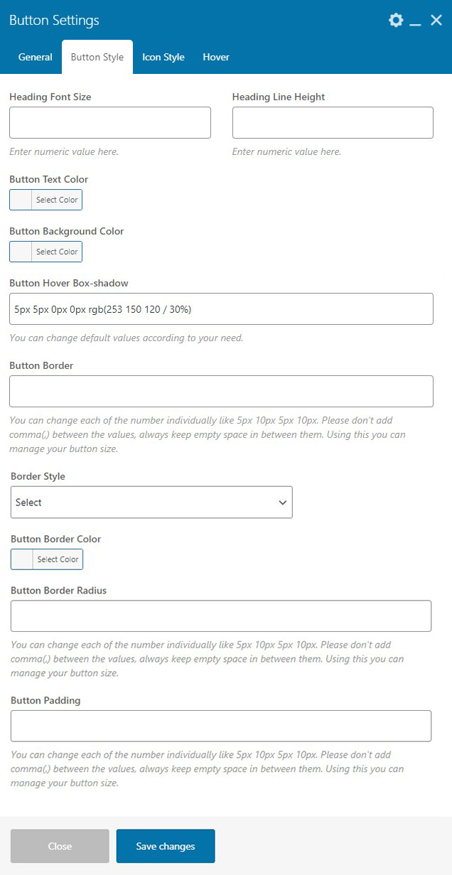
Button Style Settings
- Heading Font Size - You can set the heading font size of the button from here. Enter numeric value only.
- Heading Line Height - You can adjust the heading line height using the settings. Enter numeric value here.
- Button Text Color - You can add or change the color of the button text.
- Button Hover Box-shadow - You can set the box shadow of the button on hover. You can change default values according to your need.
- Button Border - You can set the width of the border of the button. You can change each of the number individually like 5px 10px 5px 10px. Please don't add comma(,) between the values, always keep empty space in between them. Using this you can manage your button size.
- Border Style - You can select the style for the border as per need from the given options.
- Button Border Color - You can add or change the color of the border of the button.
- Button Border Radius - You can adjust the radius of the border.You can change each of the number individually like 5px 10px 5px 10px. Please don't add comma(,) between the values, always keep empty space in between them. Using this you can manage your button size.
- Button Padding - You can adjust the padding of the button. You can change each of the number individually like 5px 10px 5px 10px. Please don't add comma(,) between the values, always keep empty space in between them. Using this you can manage your button size.
Button Style Settings
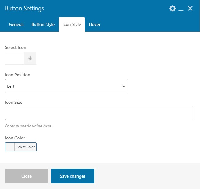
- Select Icon - You can choose the icon for the button.
- Icon Position - You can adjust the position of the icon either as Left or Right.
- Icon Size - You can set the icon size. Please enter numerical value only.
- Icon Color - You can add or change the icon color.
Button Hover Settings
- Hover - Select the checkbox to enable the hover settings on the button.
- Icon Hover Color - You can add or change the icon color on hover.
- Button Hover Background Color - You can add or change the background color of the button on hover.
- Button Border Hover Color - You can add or change the border color of the button on hover.
- Hover Text Color - You can add or change the text color of the button on hover.
4.3 Team
You can show your team members with the help of this shortcode.
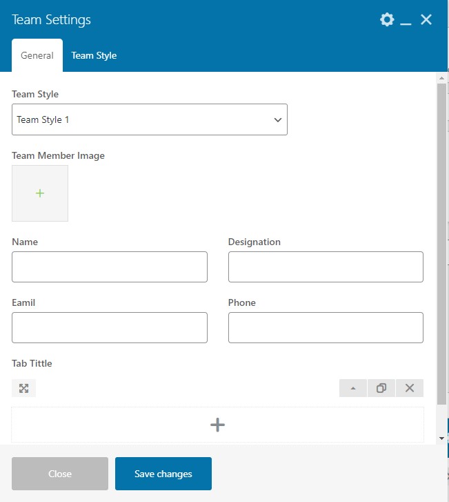
General Setting
- Team Style - You can select or change the style for the team.
- Team Member Image - You can upload the image of the team member.
- Name - Enter name of the member.
- Designation - Enter designation of the member.
- Email - Enter an email address of the member.
- Phone - Enter the contact number of the member.
- Add Tab - You can add the tab with this setting.
Team Style
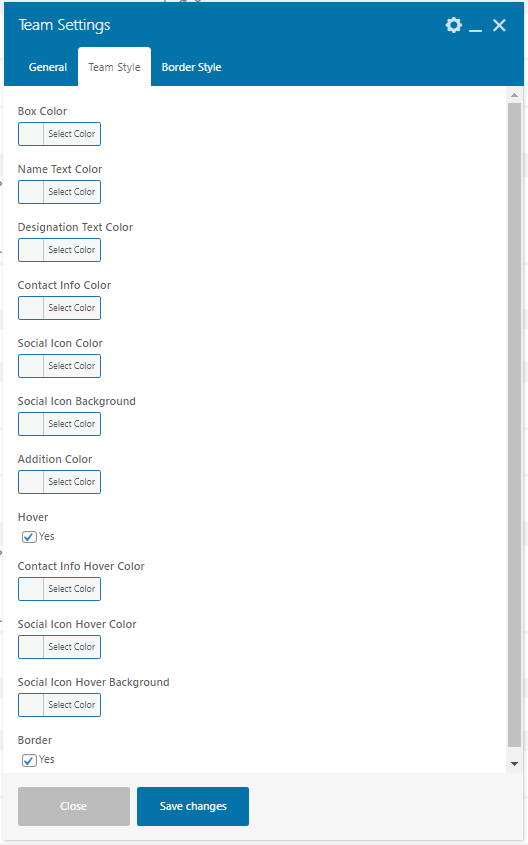
- Box Color - You can select the box color in the team section.
- Name Text Color - You can select the name text color.
- Designation Text Color - You can select the designation text color.
- Contact Info Color - You can select the contact info color with this setting.
- Social Icon Color - You can select any color for the social icon.
- Social Icon Background - You can choose any color of the background of the social icon.
- Additional Color - You can choose any color as additional colors.
- Hover - Select the checkbox to enable the hover effects.
- Contact Info Hover Color - You can add or change the contact info color on hover with this setting .
- Social Icon Hover Color - You can add or change the social icon color on hover.
- Social Icon Hover Background - You can add or change the social icon background color on hover.
- Border - Select the checkbox to enable border settings.
Border Style
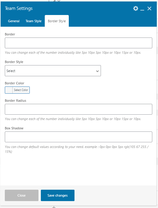
This section will appear when you enable the border setting in the Team Style
- Border - You can adjust the width of the border.You can change each of the number individually like 5px 10px 5px 10px or 10px 15px or 10px.
- Border Style - Select the border style as per need from the given options.
- Border Color - You can add or change the border color.
- Border Radius - You can adjust the border radius using this setting.You can change each of the number individually like 5px 10px 5px 10px or 10px 15px or 10px.
- Box Shadow - You can adjust the box shadow using this setting.You can change each of the number individually like 5px 10px 5px 10px or 10px 15px or 10px.
4.4 Image
With this shortcode, you can add an image in various sections of your site.
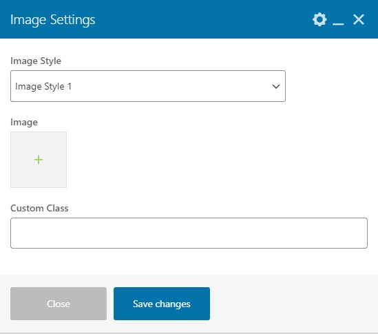
Image Settings
- Image Style - You can select the style of the image according to your need.
- Image - You can upload the image using this setting.
- Custom Class - You can add any custom class code here.
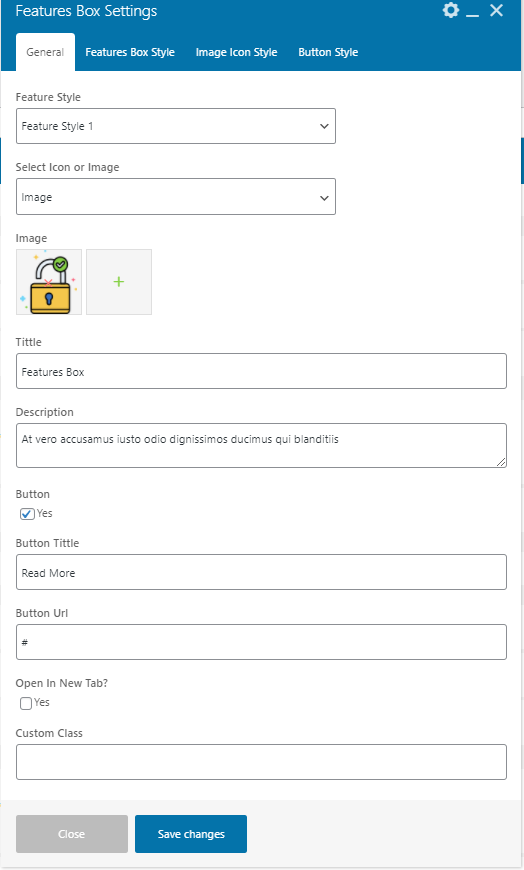
4.5 Features Box
Users can add qualities to the websites using features shortcode. Our feature shortcode has a variety of styles so that user can display the attributes of the websites according to the need.
General Setting
- Feature Style - Users can select the style of the feature as required.
- Select Icon or Image - Users can select the feature icon or image according to the need and will get the settings accordingly.
- Image - Upload the feature image here. This setting will appear when you select the Image option.
- Select Icon - Select the icon as per need. This setting will appear when you select the Icon option.
- Title - Enter the title of the feature.
- Description - You can add a description of the feature you added.
- Button - To enable the button select the checkbox.
- Button Title - Enter the title of the button.
- Button Url - Enter the URL of the button where you want to redirect the page.
- Open In New Tab? - Select the check box if you want to open the link in a new tab.
- Custom Class - Enter the custom class code here.
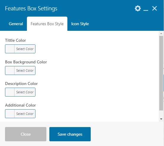
Feature Box Style Setting
- Title Color - You can add or change the title color.
- Box Background Color - You can add or change the feature box background color.
- Description Color - You can add or change the description color.
- Additional Color - You can choose any color as an additional color for the feature box.
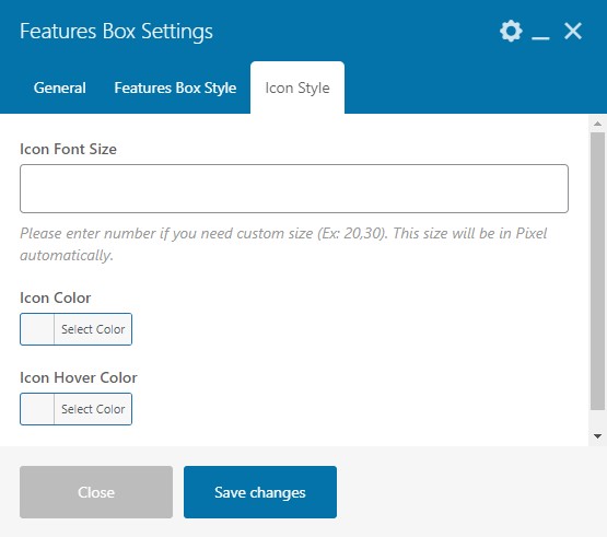
Icon Style Setting
These settings will appear when you select Icon type in the general settings
- Icon Font Size - You can adjust the font size of the icon.
- Icon Color - You can add or change the feature box icon color.
- Icon Hover Color - You can add or change the icon color on hover.
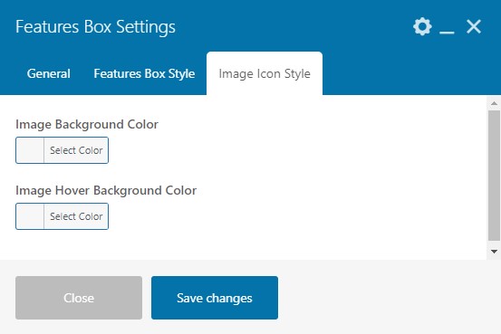
Image Icon Style Setting
These settings will appear when you select image type in the general settings.
- Image Background Color - You can add or change the image background color.
- Image Hover Background Color - You can add or change the image background color on hover.
Image Icon Style Setting
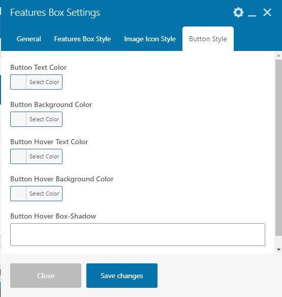
These settings will appear when you enable the button in the general settings.
- Button Text Color - You can add or change the button text color.
- Button Background Color - You can add or change the button background color .
- Button Hover Text Color - You can add or change the button text color on hover.
- Button Hover Background Color - You can add or change the button background color on hover.
- Button Hover Box Shadow - You can adjust the box shadow of the button on hover.
4.6 Service Box
With this shortcode, you can add services or resources offered to the customers at any section of your website.
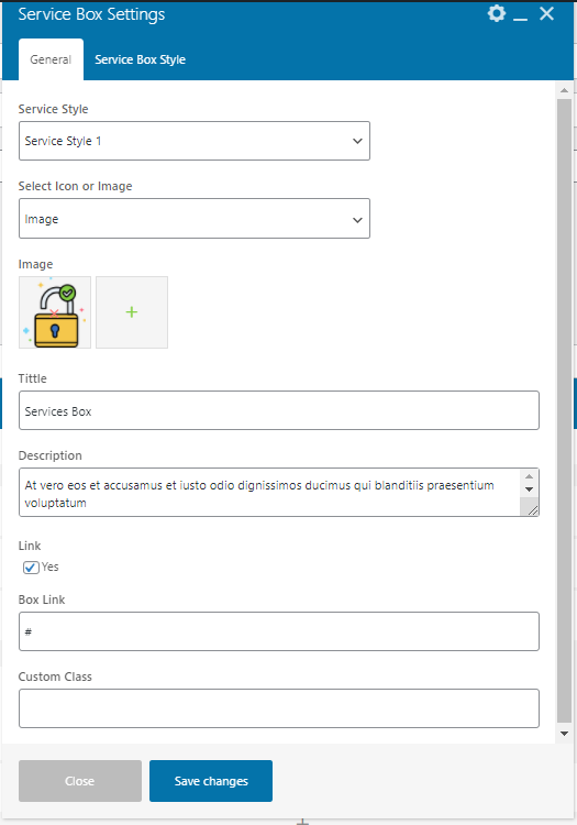
General Setting
- Service Style - Users can select the style of the service as required.
- Select Icon or Image - Users can select the service icon according to the need and will get the settings accordingly.
- Image - Upload the service image here. This setting will appear when you select the Image option.
- Select Icon - Select the icon as per need. This setting will appear when you select the Icon option.
- Title - Enter the title of the Service.
- Description - You can add a description of the service you added.
- Link - Select the checkbox to enable the link in the service box.
- Box Link - Enter the link URL where you want to redirect the page.
- Custom Class - Enter the custom class code here.
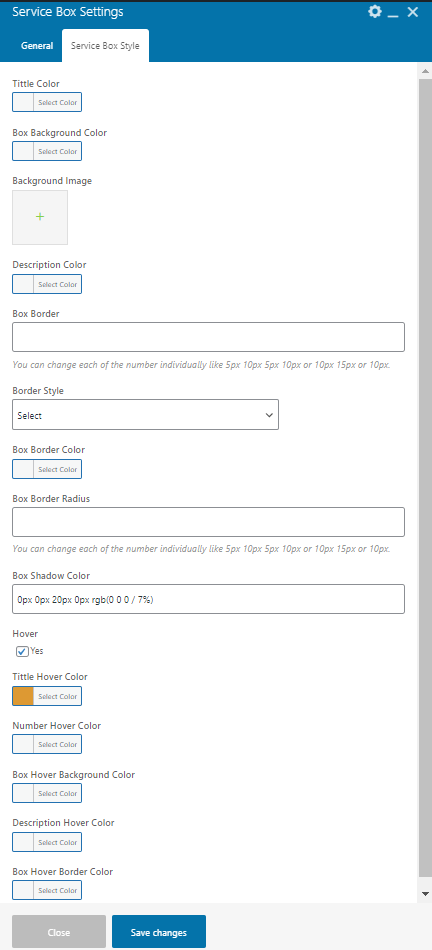
Service Box Style Settings
- Title Color - You can add or change the title color.
- Box Background Color - You can add or change the box background color.
- Background Image - You can upload the background image.
- Description Color - You can add or change the description color.
- Box Border - You can adjust the box border. You can change each of the number individually like 5px 10px 5px 10px or 10px 15px or 10px.
- Border Style - Select the border style as per need.
- Box Border Color - You can add or change the box border color.
- Box Border Radius - You can adjust the border radiyus of the box. You can change each of the number individually like 5px 10px 5px 10px or 10px 15px or 10px.
- Box Shadow Color - You can add or change the box shadow color.
- Hover - Select the checkbox to enable the hover setting.
- Tittle Hover Color - You can add or change the title color on hover.
- Number Hover Color - You can add or change the number color on hover.
- Box Hover Background Color - You can add or change the box background color on hover.
- Description Hover Color - You can add or change the description color on hover.
- Box Hover Border Color - You can add or change the box border on hover.
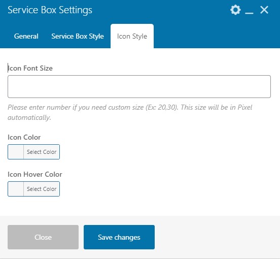
Icon Style Setting
These settings will appear when you select Icon type in the general settings
- Icon Font Size - You can adjust the font size of the icon.
- Icon Color - You can add or change the feature box icon color.
- Icon Hover Color - You can add or change the icon color on hover.
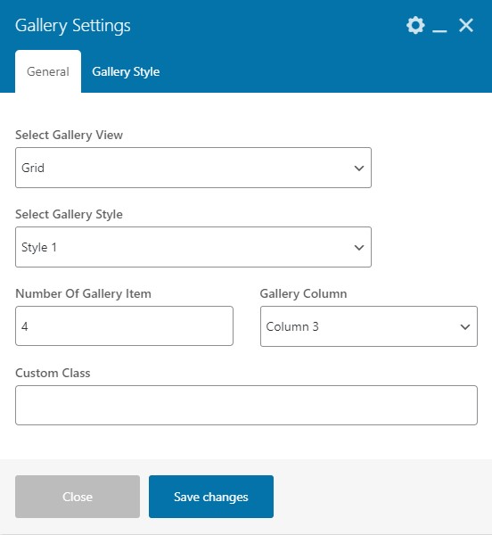
4.7 Gallery
Using this shortcode you can add a gallery to your website.
General Setting
- Select Gallery View - Select the gallery view either as Grid or Slider .
- Select Gallery Style - Select the gallery style as per need.
- Number Of Gallery Item - Enter the number of the gallery item.
- Gallery Column - Select the number of the gallery columns.
- Custom Class - Enter the custom class code.
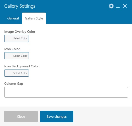
Gallery Style Setting
- Image Overlay Color - You can add or change the image overlay color .
- Icon Color - You can add or change the icon color.
- Icon Background Color - You can add or change the icon background color.
- Column Gap - Enter the numeric value here.
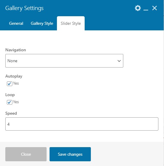
Slider Style
These settings will appear when you select the slider style in the general settings.
- Navigation - Using this option you can select the navigation type from the given three options (None, Arrows, and Bullets) and then you will get the options accordingly.
- Autoplay - Users can enable the autoplay option by selecting the checkbox.
- Loop - Users can enable the loop option in the slider by selecting the checkbox.
- Speed - You can set the speed according to your need.
4.8 Testimonials
With this shortcode, you can display testimonials.
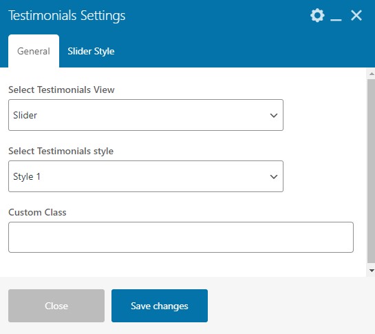
General Setting
- Select Testimonials View - With this setting user can select the testimonial view by selecting any one option between Grid and Slider.
- Select Testimonials style - Select the testimonial style from the given options.
- Custom Class - You can add custom class code.
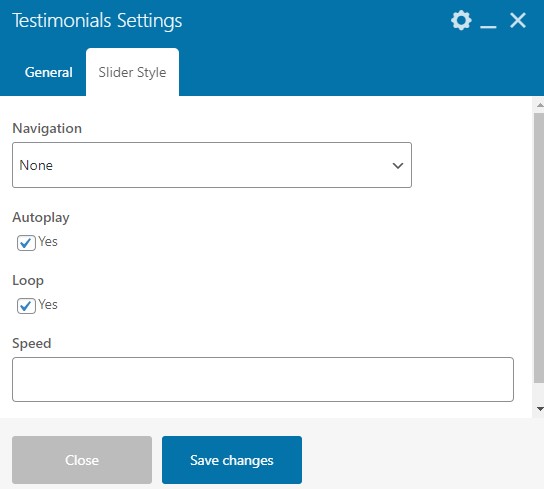
Slider Style
- Navigation - Using this option you can select the navigation type from the given three options (None, Arrows, and Bullets) and then you will get the options accordingly.
- Autoplay - Users can enable the autoplay option by selecting the checkbox.
- Loop - Users can enable the loop option in the slider by selecting the checkbox.
- Speed - You can set the speed according to your need.
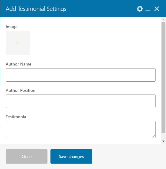
Add Testimonial Settings
These settings come in the parent's settings of the testimonial shortcode when you click on the box.
- Image - Upload the testimonial image here.
- Author Name - Enter the author name.
- Author Position - Enter the Author position.
- Testimonail - Enter the testimonial description.
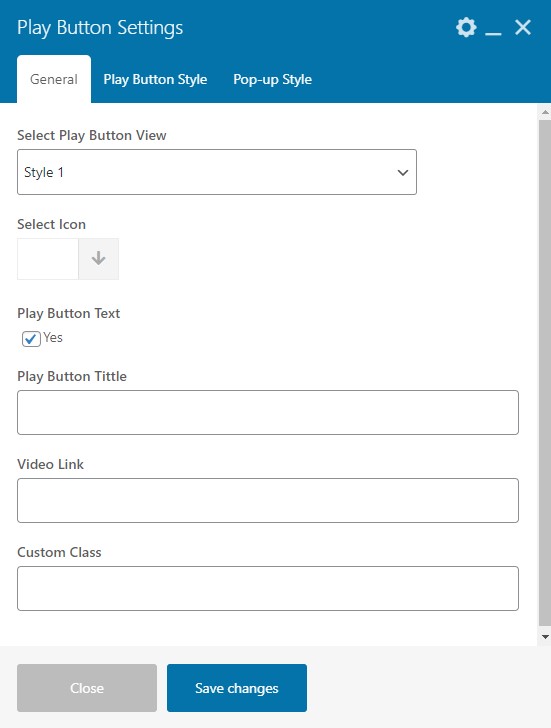
4.9 Play Button
Using this shortcode user can design the play button according to the need.
General Settings
- Select Play Button View - Select the play button view style.
- Select Icon - Select the icon for the play button.
- Play Button Text - Select the checkbox to enable the play button text.
- Play Button Title - Enter the title of the play button.
- Video Link - Enter the video link URL here.
- Custom Class - Enter the custom class code here.
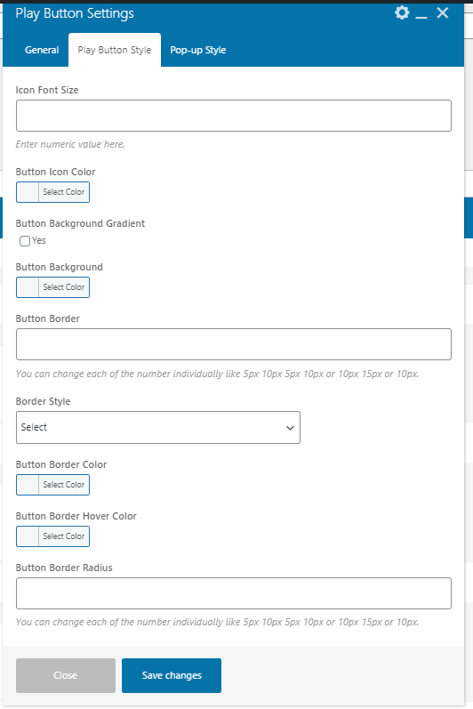
Play Button Style
- Icon Font Size - You can adjust the icon font size. Enter numeric value here.
- Button Icon Color - With this setting, you can select the button icon color.
- Button Text Color - With this setting, you can select the button text color.
- Button Text Background Color - You can select the background color of the button text.
- Button Background Gradient - Select the checkbox to enable the button background gradient.
- Button Background - You can select the background color of the button.
- Button Border - You can adjust the button border width. You can change each of the number individually like 5px 10px 5px 10px or 10px 15px or 10px.
- Border Style - You can select any style for the border .
- Button Border Color - You can select the border color of the button.
- Button Border Hover Color - You can select the border color of the button on hover.
- Button Border Radius - You can adjust the button border radius. You can change each of the number individually like 5px 10px 5px 10px or 10px 15px or 10px.
- Box Shadow - You can adjust the box shadow. You can change default values according to your need. example : 0px 0px 0px 5px rgb(105 67 255 / 15%).
- Box Shadow Style - Select the box shadow style as per need.
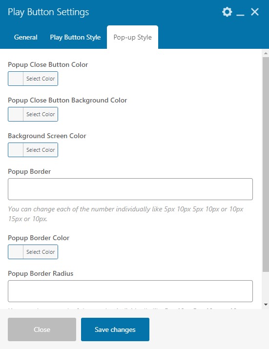
Pop- up Style
- Popup Close Button Color - You can add or change the popup close button color.
- Popup Close Button Background Color - You can add or change the popup close button background color.
- Background Screen Color - You can add or change the background screen color.
- Popup Border - You can adjust the width of the popup border. You can change each of the number individually like 5px 10px 5px 10px or 10px 15px or 10px.
- Popup Border Color - With this option, then you can add or change the popup border color.
- Popup Border Radius - You can adjust the popup border radius with this setting. You can change each of the number individually like 5px 10px 5px 10px. Please don't add a comma(,) between the values, and always keep empty space in between the values.
4.10 Counter
This shortcode is used to enable counters on your website.
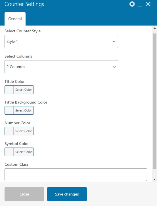
General Settings
- Select Counter Style - You can select the style for the counter.
- Select Columns - You can select the columns number for the counter.
- Title Color - You can set the color of the title of the counter.
- Title Background Color - You can set the background color of the title of the counter.
- Number Color - You can add or change the color of the counter number.
- Symbol Color - You can add or change the color of the symbol.
- Custom Class - Enter the custom class code.
Counter Settings
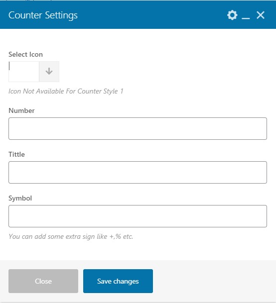
These settings come in the parent's settings of the counter shortcode when you click on the box.
- Select Icon - Select the icon for the counter.Icon is Not Available For Counter Style 1
- Number - You can enter a counter number.
- Title - Add the Title of the counter.
- Symbol - You can add some extra signs like +,%, etc.
4.11 Countdown Timer
You can use this shortcode to generate curosity and keep people interested when a special deal is available.
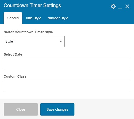
General Settings
- Select Countdown Timer Style - You can select the style of the countdown according to your need.
- Select Date - Please enter the targeted date here.
- Custom Class - Enter the custom class code here.
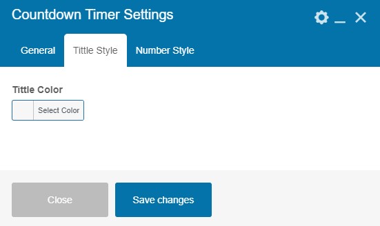
Title Style
- Title Color - With this setting, you can add or change the title color of the countdown timer.
Number Style
- Number Color - With this setting, you can add or change the number color of the countdown timer.
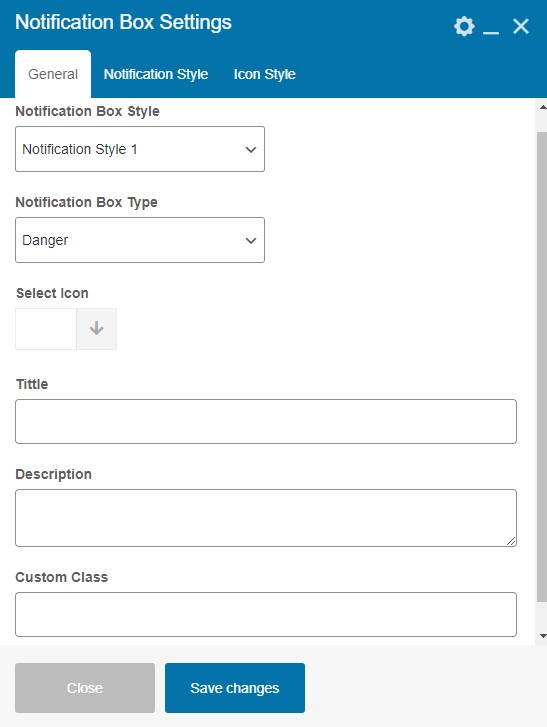
4.12 Notification Box
This shortcode enables a box to show notification messages.
General Settings
- Notification Box Style - You can select the style for the notification box according to your need.
- Notification Box Type - You can select the type of the notification box from the given options. ( Danger, Warning, Info, Success ).
- Select Icon - You can select the icon for the notification box.
- Title - Enter the title here.
- Description - Enter the description here.
- Custom Class - Enter the custom class code.
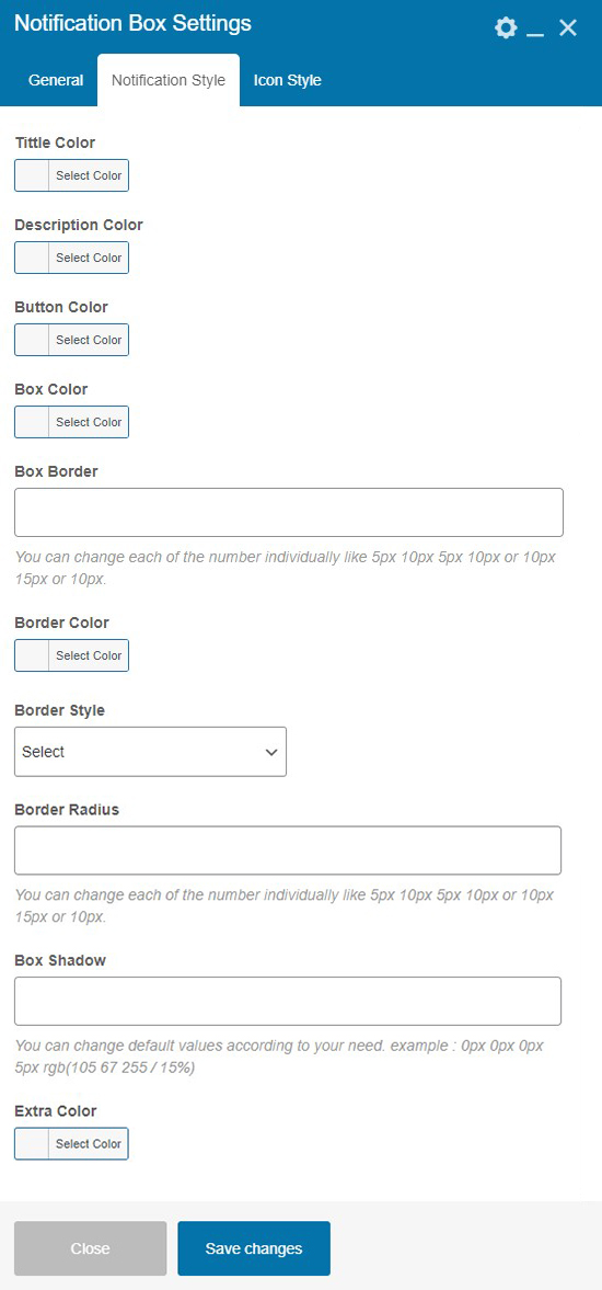
Notification Style
- Title Color - You can add or change the title color of the notification box.
- Description Color - You can add or change the description color of the notification box.
- Button Color - You can add or change the button color of the notification box.
- Box Color - You can add or change the box color of the notification box.
- Box Border - You can adjust the notification box border width using this setting. You can change each of the number individually like 5px 10px 5px 10px or 10px 15px or 10px.
- Border Color - You can add or change the border color of the notification box.
- Border Style - Select the border style for the notification box as per need.
- Border Radius - You can adjust the border radius of the notification box. You can change each of the number individually like 5px 10px 5px 10px or 10px 15px or 10px.
- Box Shadow - You can adjust the box shadow of the notification box. You can change default values according to your need. example : 0px 0px 0px 5px rgb(105 67 255 / 15%).
- Extra Color - You can add or change the extra color.
Icon Style
- Icon Color - You can add or change the icon color of the notification box.
- Icon Background Color - You can add or change the icon background color of the notification box.
- Icon Hover Color - You can add or change the icon color on hover.
- Icon Hover Background Color - You can add or change the icon background color on the hover.
4.13 List
By this shortcode, you can add, remove, or edit your list section on the website.
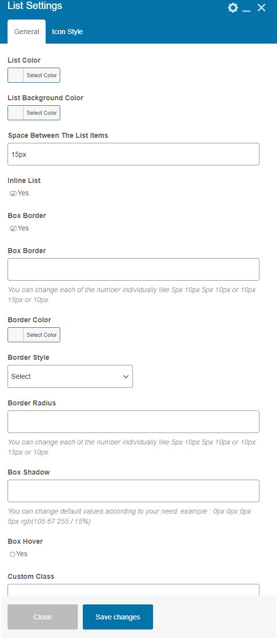
General Setting
- List Color - You can add or change the list color.
- List Background Color - You can add or change the background color of the list.
- Space Between The List Items - You can adjust the space between the list items. Enter only numeric values and also add suffix like px
- Inline List -With this setting you can set all list item in line . For that please select the checkbox.
- Box Border - To enable the box border select the checkbox.
- Box Border - You can adjust the width of the border. You can change each of the number individually like 5px 10px 5px 10px or 10px 15px or 10px.
- Border Color - With this setting you can set the color of the border of list items.
- Border Style - You can select the style of the border from the given option as needed.
- Border Radius - You can adjust the border radius with this setting. You can change each of the number individually like 5px 10px 5px 10px.
- Box Hover - To enable the hover effect on the box, select the checkbox. If enabled you will get the settings accordingly.
- Custom Class - You can enter custom class code here.
List Icon Style
- Icon Color - You can add or change the color of the icon with this setting.
- Icon Alignment - You can adjust the alignment of the icon either as left or right .
- Icon Background Color - You can add or change the color of the icon background.
- Icon Border - You can adjust the width of the border. You can change each of the number individually like 5px 10px 5px 10px or 10px 15px or 10px.
- Icon Border Color - You can add or change the color of the icon border.
- Icon Border Style - You can select the border style of the list icon from the given option.
- Icon Border Radius - You can adjust the radius of the border. You can change each of the number individually like 5px 10px 5px 10px.
- Icon Hover - With this setting you can enable the hover option by selecting the Yes Option and will get the settings accordingly.
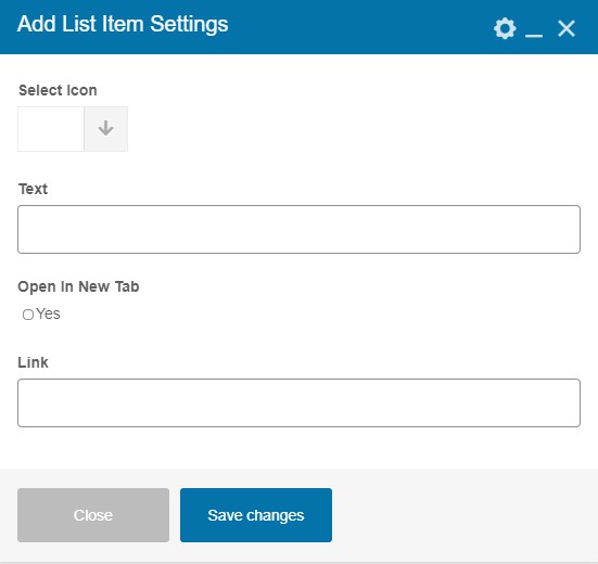
Add List Item Setting
These settings appears in the parent's settings of the list shortcode when you click on the box.
- Select Icon - You can select the icon for the list item.
- Text - You can add the text of the list by this setting.
- Open In New Tab - Select the checkbox if you want to open the link in the new tab.
- Link - Add the link URL where you need to redirect the page .
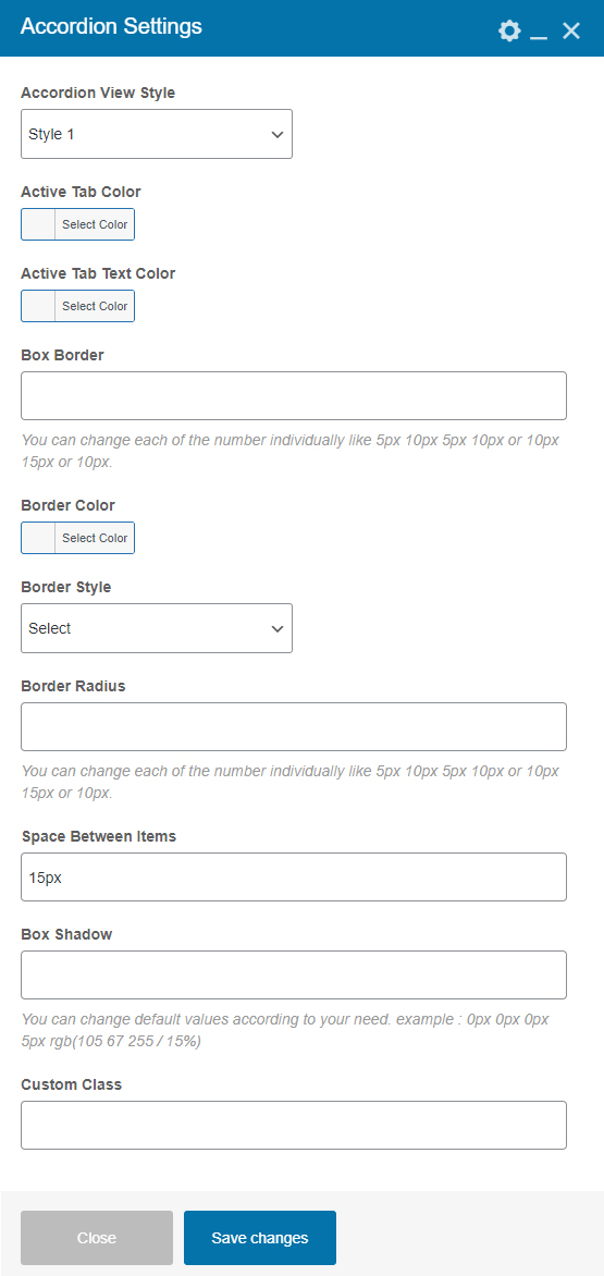
4.15 Accordion
With this shortcode, you can add a series of contents to sections with headers.
General Settings
- Accordion View Style - You can select any style for the accordion.
- Active Tab Color -You can add or change the active tab color.
- Active Tab Text Color - You can add or change the active tab text color.
- Box Border - You can set the box border width here. You can change each of the number individually like 5px 10px 5px 10px or 10px 15px or 10px.
- Border Color - You can add or change the border color of the box.
- Border Style - You can select the border style from here.
- Border Radius - You can adjust the border radius from here. You can change each of the number individually like 5px 10px 5px 10px or 10px 15px or 10px.
- Space Between The Items - You can add the space between the items. Enter only numerical values.
- Box Shadow - You can adjust the box shadow. You can change default values according to your need. example : 0px 0px 0px 5px rgb(105 67 255 / 15%).
- Custom Class - You can enter custom class code here.
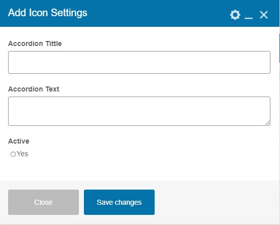
Add Icon Settings
These settings come in the parent's settings of the Accordion shortcode when you click on the box.
- Accordion Title - You can add a title here.
- Accordion Text - You can enter the text here.
- Active - You can make accordion active by selecting the checkbox.
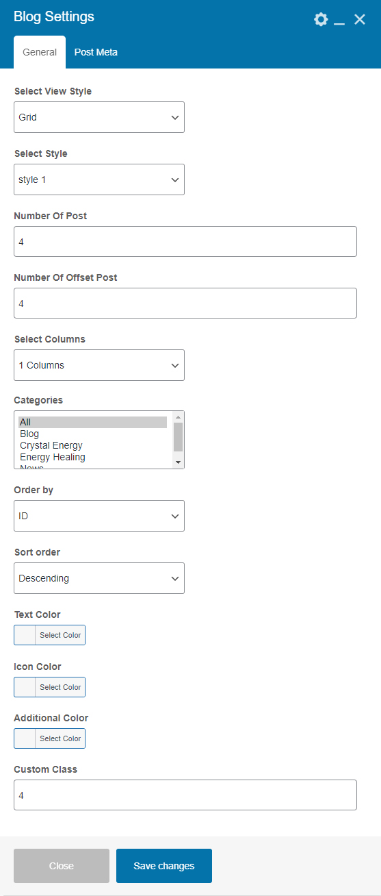
4.16 Blog
With this shortcode, you can add blog posts to your website.
General Settings
- Select View Style - You can select the view mode (Grid, List or Slider) of the blog post and will get the settings accordingly .
- Select Style - You can select the style of the blog post.
- Number Of Posts - Enter number of posts you want to display.
- Number Of Offset Posts - Enter number of offset posts you want to display.
- Select Columns - You can select the columns according to your need.
- Categories - Select the category which you made in the post section.
- Order by - You can set order (ID, Date, Title, Random) of the posts.
- Sort order - You can sort the posts either in Ascending or Descending order.
- Text Color - You can add or change the color of the text of the post.
- Icon Color - You can add or change the color of the icon of the post.
- Additonal Color - You can add or change the additional color in the blog posts.
- Custom Class - You can add custom class code here.
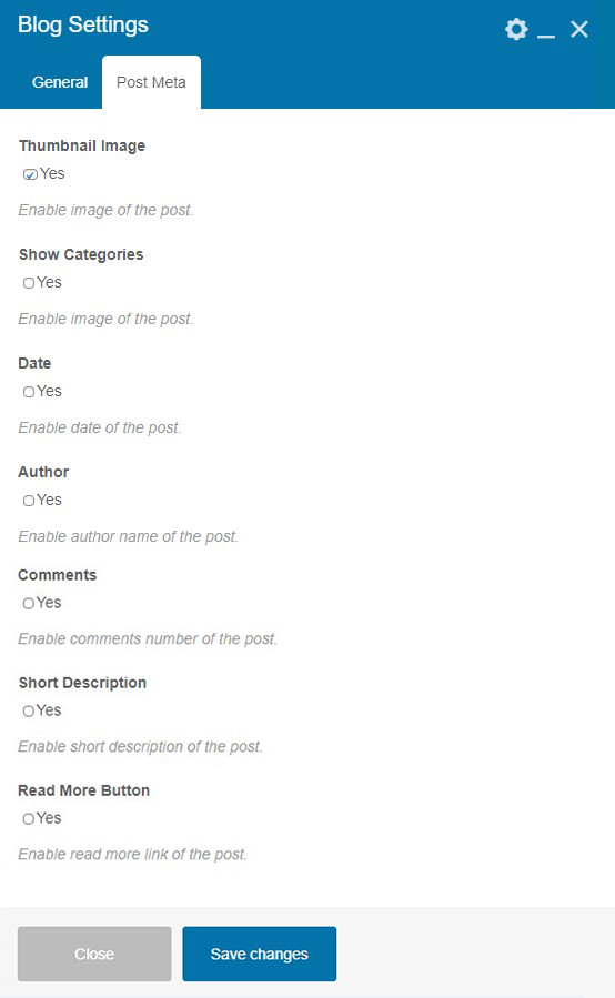
Post Meta
- Thumbnail Image - To enable the image of the post select the checkbox.
- Show Categories - To enable the categories of the post select the checkbox.
- Date -To enable the date of the post select the checkbox.
- Author - To enable the author name select the checkbox.
- Comments -Enable comments number of the post with this setting.
- Short Description - If enabled displays the short description of the post
- Read More Button - To enable the read more button select the checkbox. It will redirect users to the single page.
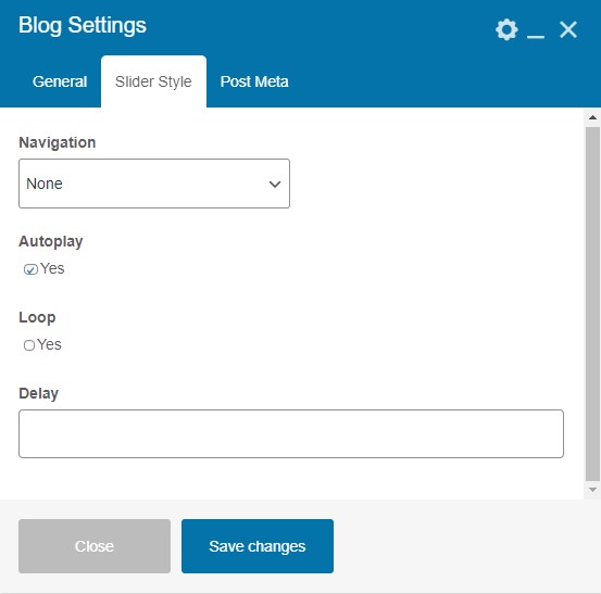
Slider Style Settings
These settings will appear when you select the slider style as a view style.
- Navigation - Using this option you can select the navigation type from the given options (None, Arrows, Bullets) and the you will get the options accordingly.
- AutoPlay - You can enable the autoplay option by selecting the checkbox.
- Loop - You can enable the loop option in the slider by selecting the checkbox.
- Delay - Enter the delay time here.
4.17 Categories
By using this shortcode users can add the categories of the products on the website.
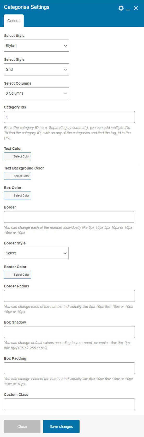
General Settings
- Select Style - You can select any style for the categories.
- Select Style - You can select the view style of categories as grid or slider and will get the settings accordingly.
- Select Columns - You can select number of the columns to display categories.
- Category IDS - Enter the category ID here. You can add multiple IDs by separating them with comma's(,). To find the category ID, click on any of the categories and find the tag_id in the URL.
- Text Color - Here you can add or change the text color of the category.
- Text Background Color - Here you can add or change the text background color of the category.
- Box Color - Here you can add or change the box color of the category.
- Border - You can set the border width here. You can change each of the number individually like 5px 10px 5px 10px or 10px 15px or 10px.
- Border Style - You can select the border style from here.
- Border Color - You can add or change the border color of the category box.
- Border Radius - You can set the border radius here. You can change each of the number individually like 5px 10px 5px 10px or 10px 15px or 10px.
- Box Shadow - You can set the box shadow with this setting. You can change default values according to your need. example : 0px 0px 0px 5px rgb(105 67 255 / 15%).
- Box Padding - You can set the box padding here. You can change each of the number individually like 5px 10px 5px 10px or 10px 15px or 10px.
- Custom Class - You can add custom class code here.
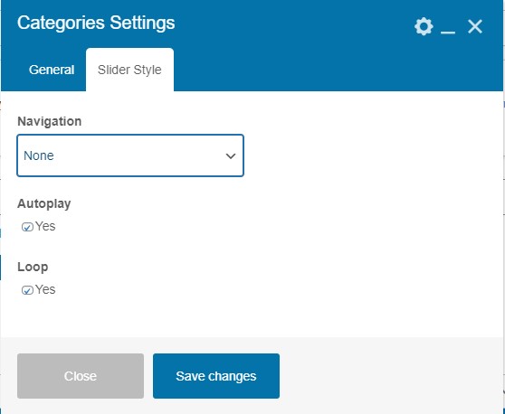
Slider Settings
You will get the Slider settings when you select slider as a view mode.
- Navigation - Using this option you can select the navigation type from the given options (None, Arrows, and Bullets ) and the user will get the options accordingly.
- AutoPlay - You can enable the autoplay option by selecting the checkbox.
- Loop - You can enable the loop option in the slider by selecting the checkbox.
4.18 Tab
With this shortcode, the user can add tabs to the website.
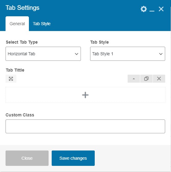
General Settings
- Select Tab Type - You can select the tab type. We have provided the two options Horizontal Tab and Vertical Tab .
- Tab Style - Select the tab style according to the need.
- Tab Title - Add the tab title here.
- Custom Class - You can enter the custom code here.
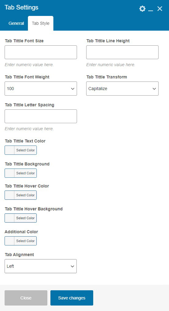
Tab Style
- Tab Title Font Size - You can adjust the font size of the title of the tab. Enter the numeric value here.
- Tab Title Line Height - You can adjust the line height of the title of the tab. Enter the numeric value here.
- Tab Title Font Weight - You can select the font weight of the title of the tab.
- Tab Title Transform - You can transform the title of the tab in (Uppercase, Lowercase, Capitalize ) as per need.
- Tab Title Letter Spacing - You can adjust the letter spacing of the title of the tab. Enter the numeric value here.
- Tab Title Text Color - You can add or change the tab title text color.
- Tab Title Background - You can add or change the tab title background color.
- Tab Title Hover Color - You can add or change the tab title color on hover.
- Tab Title Hover Background - You can add or change the tab title background color on hover.
- Additional Color - You can add or change the additional color.
- Tab Alignment - You can align the tab in Left, Center, Right position.
4.19 Pricing
With this shortcode, users can set the pricing plan on their website.
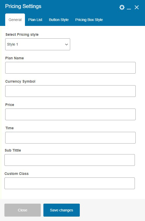
General Setting
- Select Pricing Style - You can select a pricing style from here.
- Plan Name - You can write a name of the plan.
- Currency Symbol - You can enter the symbol of the currency.
- Price - You can decide the pricing of the plan.
- Time - You can add the time duration (year, month, week, days).
- Sub Title - You can enter the sub title.
- Custom Class - You can enter the custom class code here.
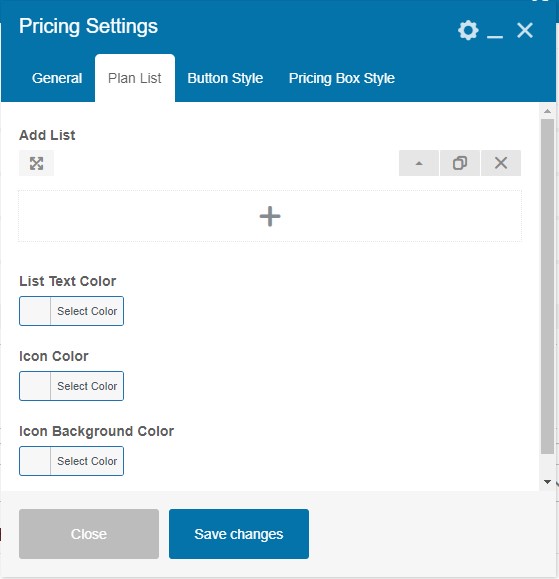
Plan List
- Add List - You can add a list by clicking on the box.
- List Text Color - You can add or change the list text color.
- Icon Color - You can add or change the icon color.
- Icon Background Color - You can add or change the background color of the icon.
- Time - You can add the time duration in (year, month, week, days) any format.
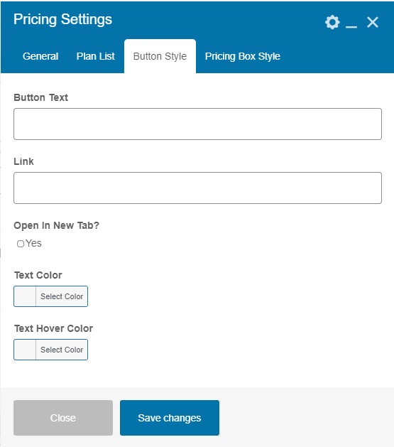
Button Style
- Button Text - You can enter the text to be displayed on the button.
- Link - Enter the URL of the link where you want to redirect the page.
- Open In New Tab? - If enabled then link will be opened in the new tab.
- Text Color - You can add or change the text color of the button.
- Text Hover Color - You can add or change the text color of the button on hover.
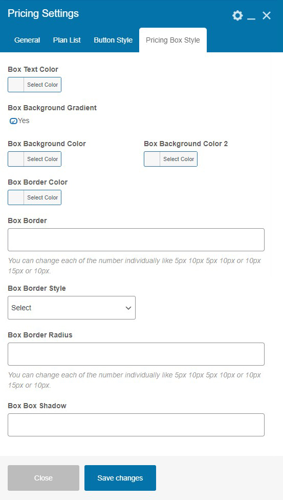
Pricing Box Style
- Box Text Color - You can add or change the box text color.
- Box Background Gradient - Select the checkbox to enable the box background as gradient and you will get the settings accordingly.
- Box Background Color - You can add or change the box background color.
- Box Background Color 2 - You can add or change the box background color 2.
- Box Border Color - You can add or change the box border color.
- Box Border - You can adjust the width box border. You can change each of the number individually like 5px 10px 5px 10px or 10px 15px or 10px.
- Box Border Style - You can select the style of the border of the box as per need.
- Box Border Radius - You can adjust the radius box border. You can change each of the number individually like 5px 10px 5px 10px or 10px 15px or 10px.
- Box Border - You can adjust the box border shadow with this settings.
5. Outro
Thank you for your purchase. If you have any questions that are beyond the scope of this help file, please contact us through support@pixelnx.com
Once again, thank you so much for purchasing this Plugin. As I said at the beginning, I'd be glad to help you if you have any questions relating to this Plugin. No guarantees, but I'll do my best to assist.
Copyright © 2025-26 Built It Shortcodes Addon. All Right Reserved By Kamlesh Yadav.
4.14 Social Icon
Using this shortcode users can add social icons in any section of the website and also change the design according to the requirement.
Social Icon Settings
Add Icon Settings
These settings appears in the parent's settings of the Social Icon shortcode when you click on the box.